Color Information
Colors
Color is the effect of light on our eyes after hitting an object. In order for us to perceive colors; The reflections of the colors coming from a light source from the surface they hit must reach our eyes. The color that emerges from the light source and how much of the color reflects from the surface it hits determines the color we see.
- Main Colors
- Intermediate Colors
- Achromatic Colors
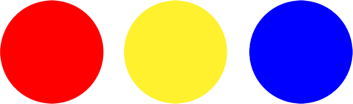
The main colors are Red, Yellow and Blue. As these colors are mixed, all other colors are obtained.
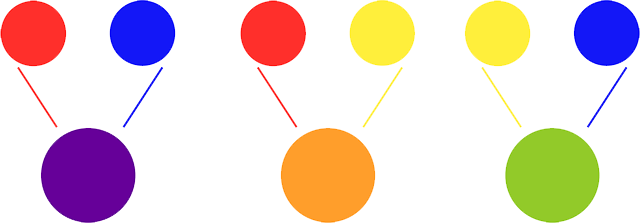
Intermediate colors are Purple, Orange and Green. The mix of primary colors gives us intermediate colors.
If an object does not reflect the colors it receives from sunlight and swallows it, we will see that object in black. When we mix black and white color, gray appears. Black, white and gray shades between them are called achromatic colors.

Properties of Colors
- Tint of Color
- Saturation of Color
- Color Temperature
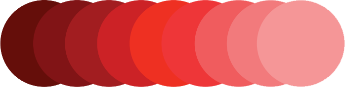
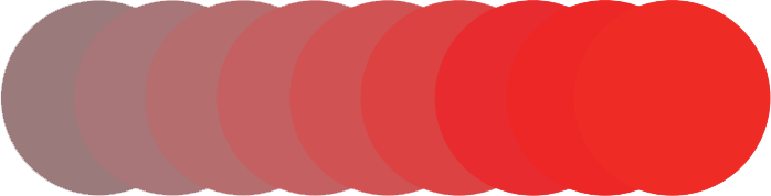
Considering a wide picture in which the color gradually turns to white and dark to black; Steps approaching black indicate the darker value of the color, and steps approaching the white indicate light. The steps in the middle of this table are expressed as a medium value. The lightness and darkness state of the color is called value.
According to the color property of the color, the criterion that shows the degree of brightness and vitality is called saturation. The high value reached by the color feature of the color is called "Saturated Color" and the value where the gray value is concentrated is called "Unsaturated Color". When the amount of gray in the colors increases, the vividness and brightness of the color decreases. If the color does not look vibrant and bright, and looks dirty and grayish, this color is called "Unsaturated Color". The saturation ratio is further reduced, especially if the blended color is the complementary color, that is, the opposite of the first color.
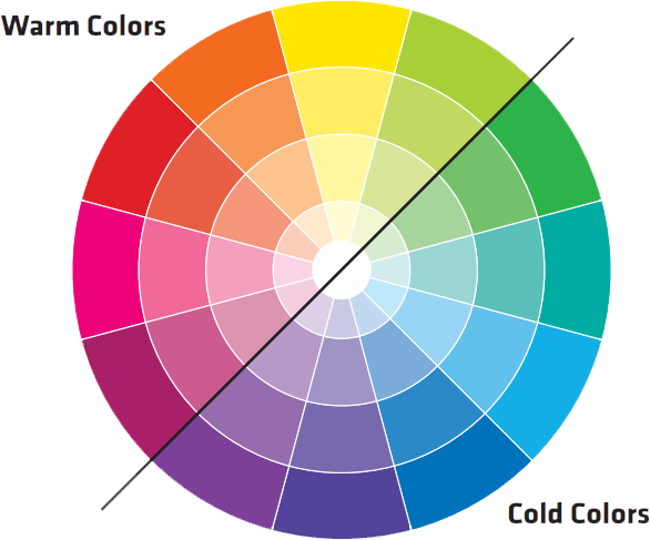
Colors are divided into two as Warm Colors and Cold Colors according to the effects of temperature and coldness that people feel. Warm Colors are Red, Orange, and Yellow. Since these colors are the fastest seen colors, they give a more active and lively effect. For this reason, it appears to be closer compared to cold colors and may make the place appear smaller than it is. Cool Colors; It is Blue, Purple and Green. It is generally noticed later than other colors, considering what it feels like in a person. For this reason, it is behind and more calm. Due to these slow effects, they have the potential to show the place more widely than it is.
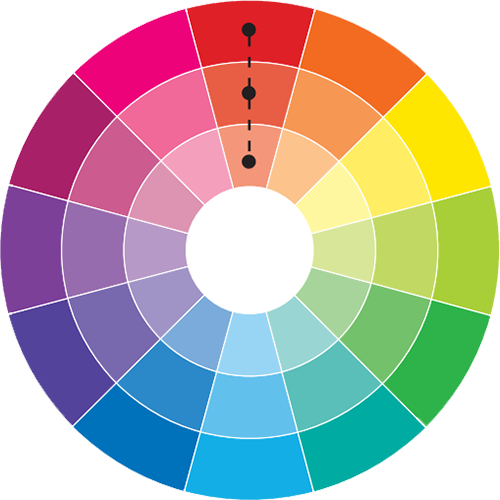
- One Color
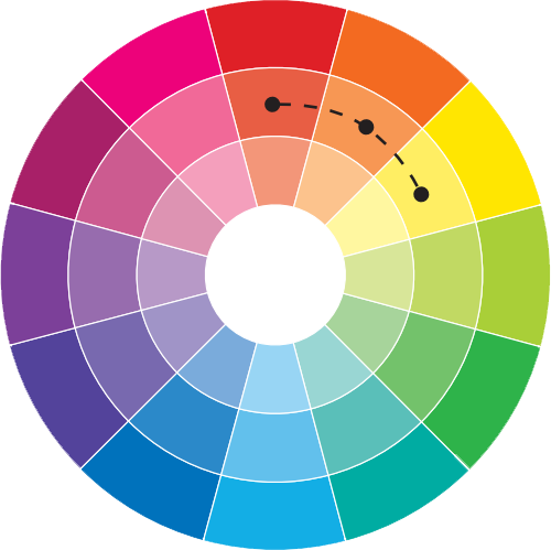
Combination - Similar Color
Combination - Complementary Color
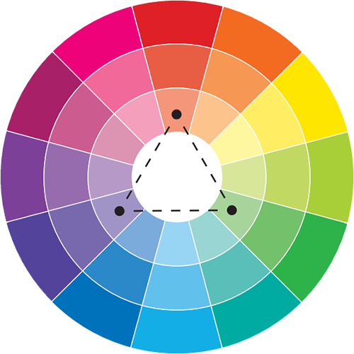
Combination - Triple Color
Combination
It is realized by choosing the colors between the light and dark tone values of a single color. This harmony variety has a stable and calm appearance.
It is the color harmony that is realized by choosing the colors adjacent to each other in the color circle. When analog colors come together, they break each other's power. These colors, which appear in the appearance, do not disturb the eyes and create a soft harmony.
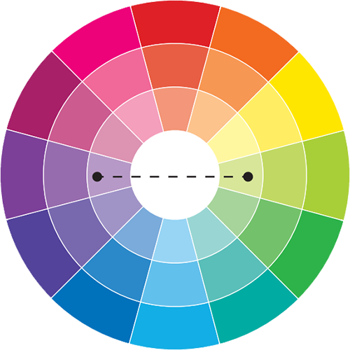
Complementary (or also known as contrasting) colors are colors that lie opposite each other on the color wheel. The combination of these colors creates a lively and energizing effect in the space. Balance is created in the design by using complementary colors in the spaces.
It is the color harmony created by using 3 colors that are equidistant from each other and form a triangle. It is the most popular harmony used in color combinations in spaces. Colors that can be used in harmony with each other are easily found with the Triple Color Harmony.